Media Query Inspector in Chrome DevTools
Responsive design is everywhere in modern web development. As Wikipedia puts it, "Responsive web design (RWD) is an approach to web design that makes web pages render well on a variety of devices and window or screen size." There are many ways to view a web page in 2020: phones, tablets, laptops, video game consoles, TVs, and computer monitors. It's important to make sure your website looks nice on a variety of devices and screen sizes.
As web developers, we know that media queries help us change pieces of our website when the window size changes. Frameworks such as Bootstrap and Foundation use media queries in an opinionated fashion to create breakpoints of popular screen sizes. For example, Bootstrap primarily uses the following media query breakpoints:
/* Small devices (landscape phones, 576px and up) */
@media (min-width: 576px) { ... }

/* Medium devices (tablets, 768px and up) */
@media (min-width: 768px) { ... }

/* Large devices (desktops, 992px and up) */
@media (min-width: 992px) { ... }

/* Extra large devices (large desktops, 1200px and up) */
@media (min-width: 1200px) { ... }
Some websites can have a lot more media queries to handle specific edge cases. It would be nice if there was an easy way to see all the media queries on a page. Well, thanks to Chrome DevTools, it's super easy! Let's experiment! 🔬
First, let's create a bit of HTML to create a div element that will be brought to life as a box with CSS:
<!DOCTYPE html>
<html lang="en">
<head>
    <meta charset="UTF-8">
    <meta name="viewport" content="width=device-width, initial-scale=1.0">
    <meta http-equiv="X-UA-Compatible" content="ie=edge">
    <title>Media Query Inspector</title>
    <link rel="stylesheet" href="style.css">
</head>
<body>
    <div>Change the screen size to change the box color!</div>
    <div class="box"></div>
</body>
</html>
The CSS will contain media queries that will change the box's color:
/* Extra small devices (portrait phones, less than 576px) */
.box {
    width: 200px;
    height: 200px;
    background-color: magenta;
}

/* Small devices (landscape phones, 576px and up) */
@media (min-width: 576px) {
    .box {
        background-color: cornflowerblue;
    }
}

/* Medium devices (tablets, 768px and up) */
@media (min-width: 768px) {
    .box {
        background-color: yellowgreen;
    }
}

/* Large devices (desktops, 992px and up) */
@media (min-width: 992px) {
    .box {
        background-color: orangered;
    }
}

/* Extra large devices (large desktops, 1200px and up) */
@media (min-width: 1200px) {
    .box {
        background-color: crimson;
    }
}
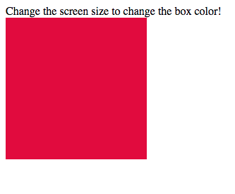
When you're finished, you should see something like this:
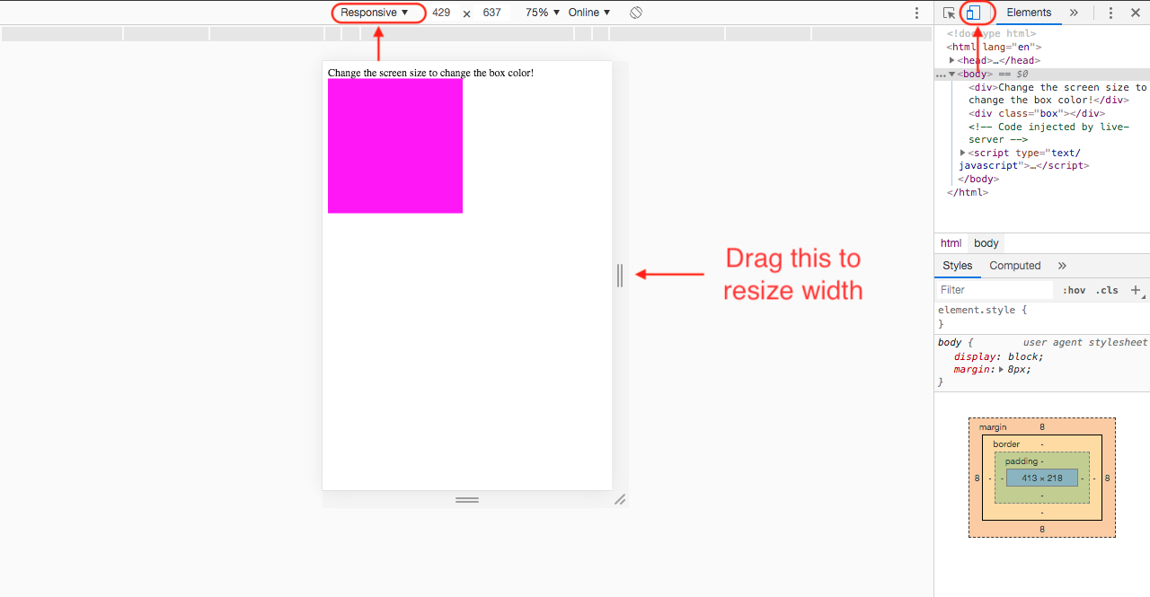
When you resize the window, it should change colors. Let's now open up Chrome DevTools using Cmd+Shift+I (on Mac) or Ctrl+Shift+I (on Windows). Click on the little mobile icon to the left of the left of the Elements tab on Chrome DevTools to toggle the device toolbar. Make sure you choose Responsive mode from the device dropdown, so it's easier to change the width of the window.
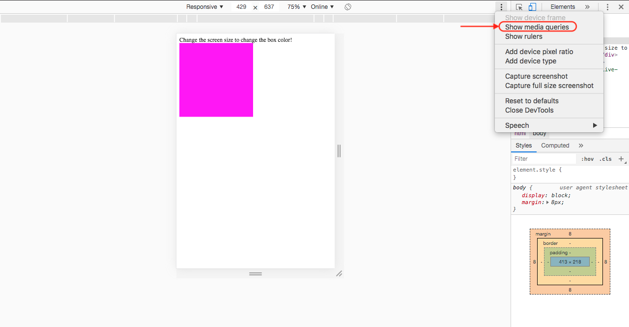
Then, click on the vertical dots on the far right of the device toolbar. You'll see lots of really useful options available. We're interested in the one that says Show Media Queries.
Click this options and you should see bars appear on the toolbar, four on the left of your web page and four bars on the right. If you don't see four bars, then try decreasing your zoom % to 75% or less. The Chrome DevTools window might take up some space, so it's hard to see the four bars unless you decrease the zoom level. You should end up seeing something like this:
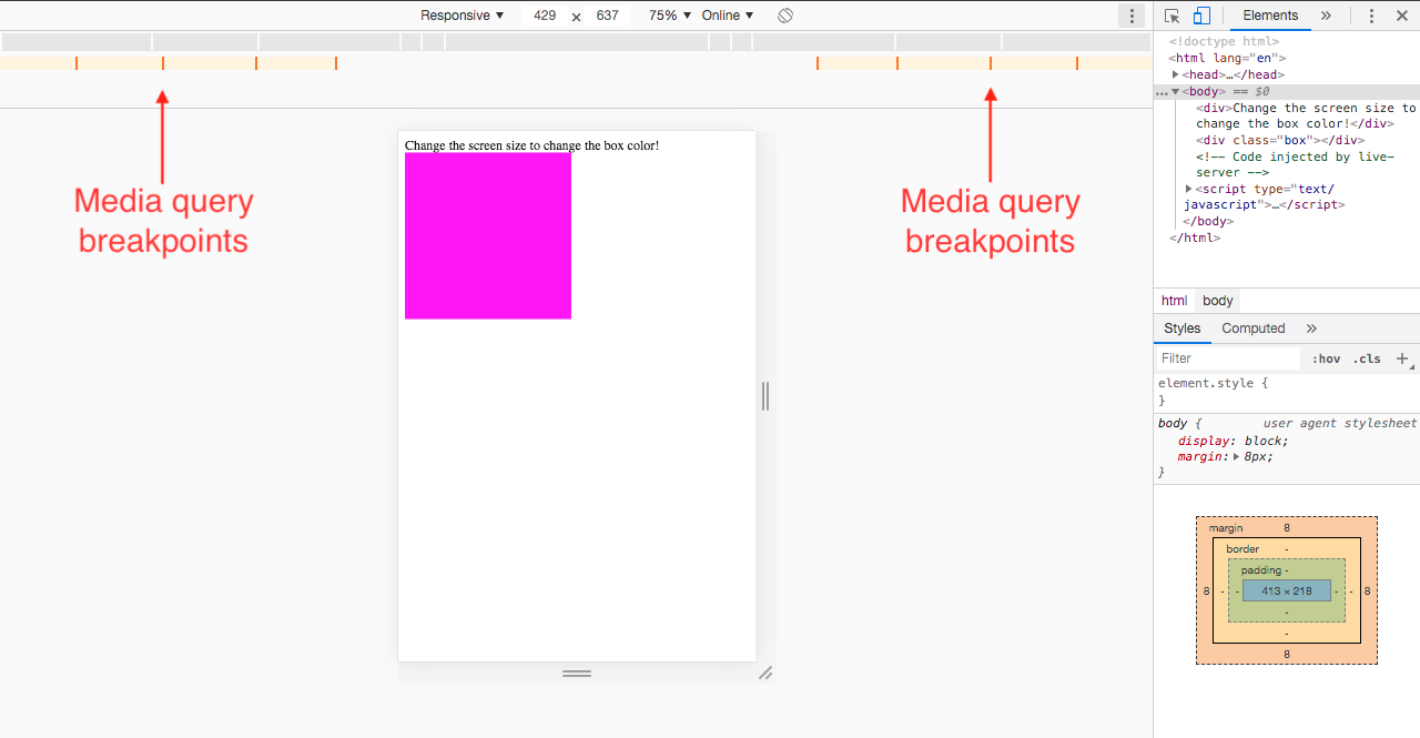
You can click on the bars to activate different media query breakpoints.
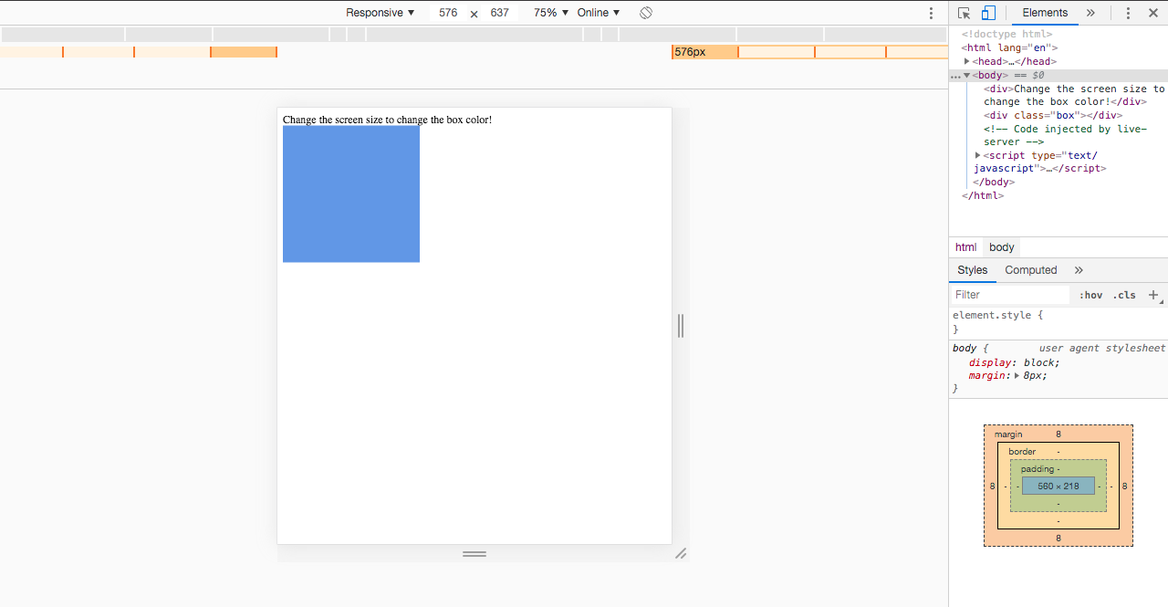
Small devices:
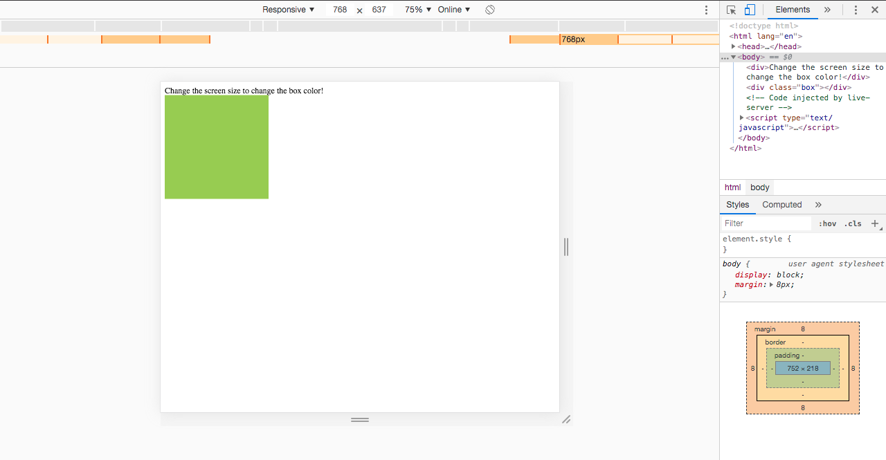
Medium devices:
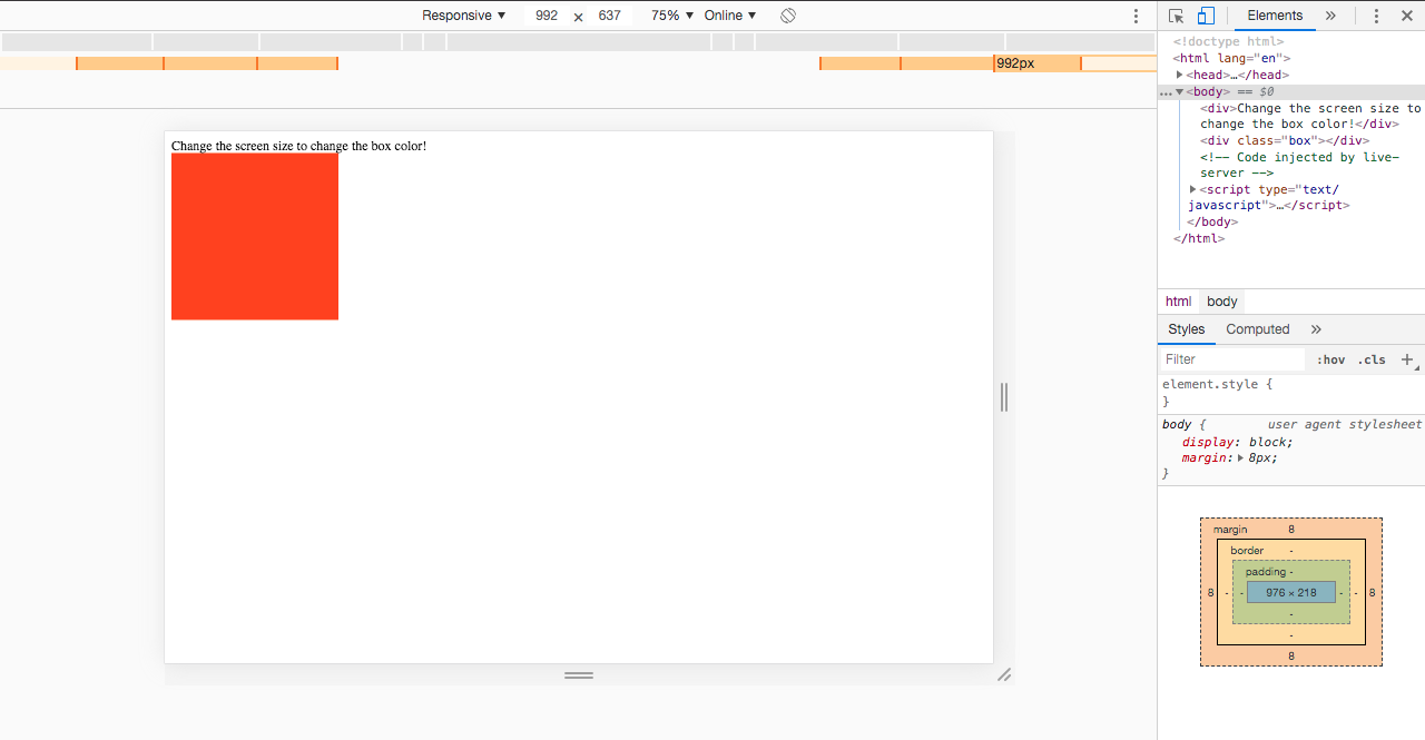
Large devices:
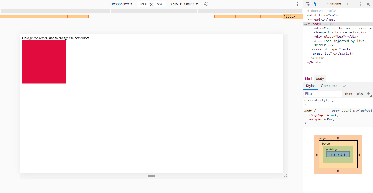
Extra large devices:
This was just a simple example to see how the media query inspector worked for Chrome DevTools. If you open up the inspector on various websites, you may see lots of breakpoints, but now you have the power to see how the layout changes at any device size.