inspirnathan Website Redesign
Greetings, friends! My website has a brand new look! ✨
Website Redesign
My website has been completely overhauled and built from scratch to incorporate new features, a modern design style, and a broader range of theme options. I also utilize a different tech stack behind the scenes to help make it easier to customize and deliver new content.
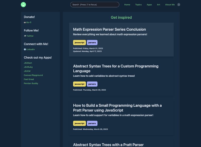
My old design looked like the following. Very bulky! The eyes aren't drawn to each post as easily.
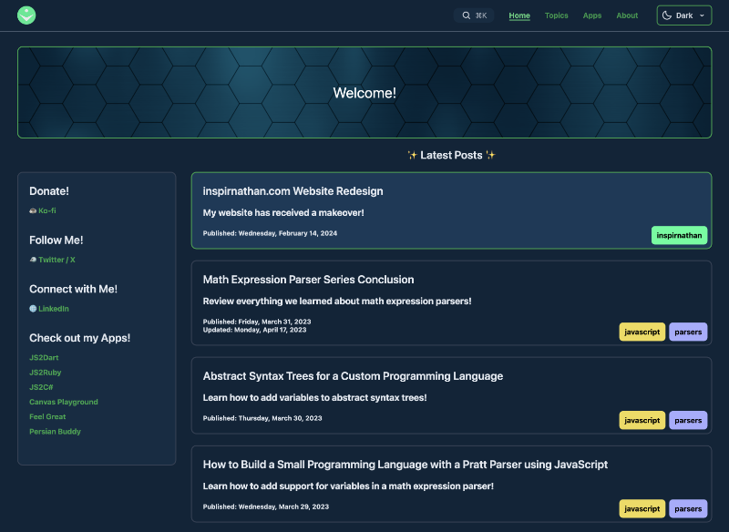
I opted for a more modern, cleaner, and compact approach when redesigning my website. Looks so crisp! Below is an example of how I squeezed the posts together and used borders to help distinguish between each post. By default, the theme is now set to dark mode instead of light mode! What was I thinking before 😅
I also added an interactive hexagon canvas at the top of the page. What will happen if you highlight all the hexagons? 🤔
Themes
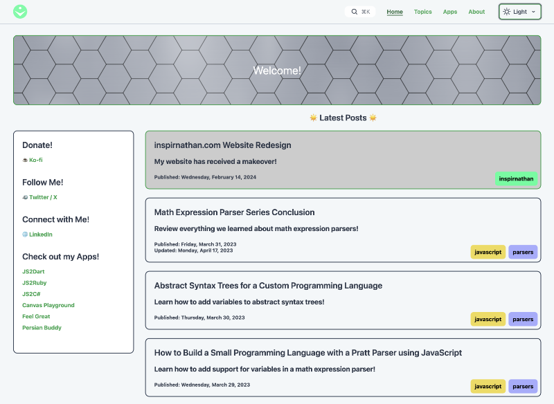
I added a new theme switcher at the top-right corner of the page. Users can now choose between themes other than light and dark mode! My personal new favorite is the Sepia theme. It was tricky getting the colors to look good across the website, but I'm glad I put in the effort because it makes the website seem much more colorful and creative 🎨
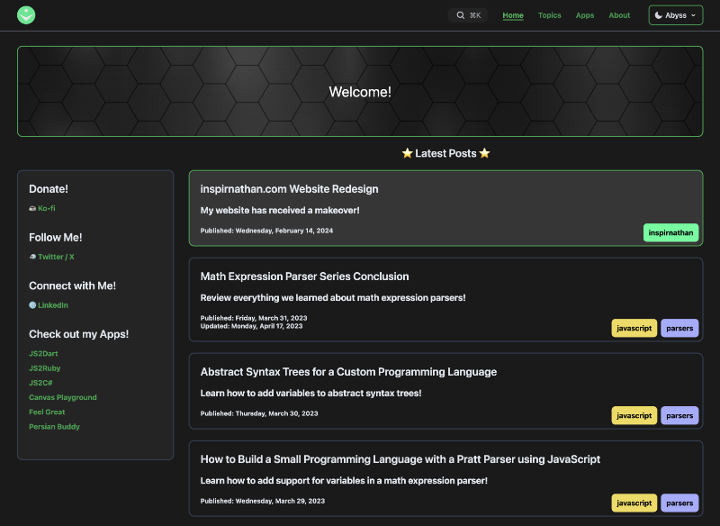
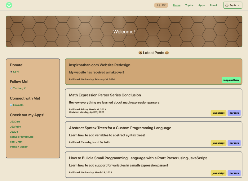
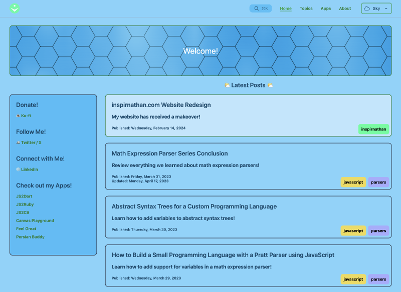
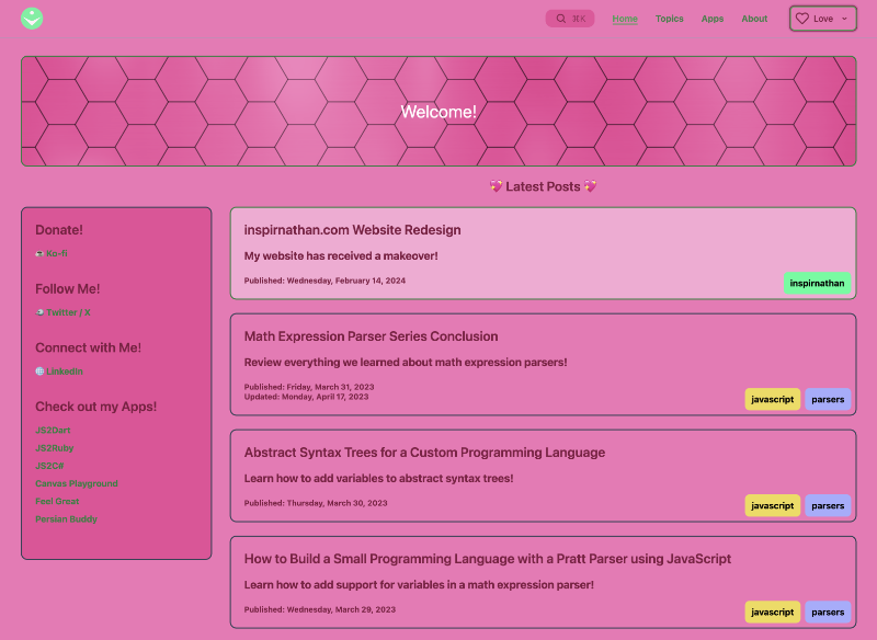
A pink theme? Yes! Happy Valentine's Day to all you amazing people reading this blog 💖
Tech Stack
Previously, my tech stack utilized Vue.js version 2, Nuxt version 2, and a special Webpack loader called frontmatter-markdown-loader. I had started my website before cool technologies like Nuxt Content came out, so I had to get creative and use Webpack loaders to analyze frontmatter in my markdown files and render them into HTML using markdown-it.
Now, my website is powered by Vue 3 and Nuxt Content v2 and wow! The developer experience (DX) is the best I've ever had when developing a new website or project. The documentation is super clean and helpful. The tools provided by the Vue team and Nuxt team are amazing! VueUse was also really helpful in providing common utilities needed across the website.
Combined with Tailwind CSS, Vue and Nuxt made development a breeze. Using Vite instead of Webpack accelerated my build times, and the Nuxt DevTools were tremendous in analyzing my website components.
New Features
My website has a few new features! As mentioned previously, the theme switcher on the top-right corner of my website can help you change between various themes besides light and dark mode! ⭐️
Every article now displays a table of contents that show where the user is on the page and provides an easy way to navigate to different sections of the page. On mobile, there's an icon on the top-left corner of the screen to open up the table of contents.
I also made it very simple to see all of my past blog posts. I added a "See All Posts" link at the bottom of every article and on the home page. This should make it easy to catch up what I've blogged about 😃
Conclusion
Website redesigns are always tricky, but I feel happy with what I've produced 🙂
I wanted the website to feel more elegant and natural without being too distracting with a bunch of animations and popups. With tools such as Vue, Nuxt, Nuxt Content, VueUse, and Tailwind, redesigning this website was practically painless. I hope it serves everyone well, and I hope you continue to read this blog. Until next time, happy coding! ✨